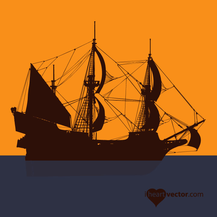
Pirate Ship

Pirate Ship
Here is a pirate ship I found on iheartvector.com until I have my own art to post.

Wednesday, December 14, 2011

Presentation with Graph

I had a really difficult time with the graph in Illustrator.  I am very used to using Excel for graphing.  I think I might use Illustrator for a very broad overview, as I tried to do in the presentation.  But since I usually make very technical presentations, the graphing tool in Excel is much more powerful.

I made a few slides using information available on my company's website: www.ssloral.com

This slide shows the quantity of SS/L (Space Systems Loral) Satellite launches between 2005-2011.

This slide shows the orbit locations, relative to Earth, of all SS/L satellites launched.  This is one of my favorite Illustrations from my company (I did not create the image on this) and I think the person that did the artwork for this made this image very exciting and applicable to the company.

This shows what a sample slide would look like.


This blog post is in no way affiliated with Space Systems/Loral business or that of Loral Communications and only uses information found on the company website at www.ssloral.com

Monday, December 12, 2011

Lesson 6 Children's Illustration

I had a fun time with this assignment.  I used my pirate flag from Assignment #1 on the sail.


Left Side Spread


Right Side Spread.


Sunday, December 11, 2011

Final Project: Society of Women Engineers (SWE) Brochure

I have made many brochures, fliers, and newsletters for both college and professional SWE sections.  The information for this yearly event isn't available yet, so I made up the date and the details; however, this can easily be filled in with the correct information later.  This was quite a challenge for me, as I would normally make brochures and other text heavy documents using InDesign, rather than Illustrator.

Brochure Outside


Brochure Inside

Lesson 10 Google Logo

I was very excited to make this Google logo.  I found the actual typeface that Google uses (Catull).  This logo is for National Pie Day, which is January 23.  I used the wood grain pattern from the background assignment to make the rolling pin.

Lesson 7 Icon Design

This 3D icon could be used on my art blog.  The letters are for my initials.  I had a really hard time getting the brushes to look how I wanted them.  I'm used to working with solid modeling software and this is just not the same and wasn't as intuitive to work with.

Saturday, December 10, 2011

Assignment #4 Backgrounds

I'm ready for ski season so my backgrounds are ski and snow themed.
Blend Tool: I used a snowflake!
Artistic Effects: I used the sponge tool on both the background and the snowflake.


Background using text: I imagine this being used for a ski resort ad by adding the resort name and logo in the lower portion of the page.


Monocolor background:


Wood Grain Background:  This can also be used to color objects with a wood grain by adding it to the swatches.

Tuesday, November 1, 2011

Landscape Assignment Part 1: Tokyo City Scape

I was inspired by a photo of the Tokyo Skyline.  My focus is on the Tokyo Tower.  I kept the lines of the background and foreground buildings at 90 degree angles in order to make the Tower stand out more.  The skyline of Tokyo often looks very flat because of the clouds, fog, and rain; especially during the winter.  I always enjoy seeing the bright red lights on the tower shining through the blue gray fog.


Tuesday, September 13, 2011

Illustrator Assignment #2- Animal Drawing

Next assignment was to draw another animal.  This time I drew a bird.


I based my drawing from the one below.


Illustrator Flag

I decided to practice some more with the blend tool.  The heart is a symbol and I found out that Illustrator would not let me replace the spine with an object that started out as a symbol or compound path.  I had to redraw the heart outline using the pen tool.  I'm not sure why the heart spacing doesn't look quite right; it may be because the shape is not symmetrical.

Monday, September 12, 2011

Assignment #1 Flag

The first assignment for Illustrator Advanced class: the European Union Flag.

Thursday, July 14, 2011

Portrait Final

This is Ryan.  I chose a tilted head pose, instead of straight on.  This took an incredibly long time.  I tried to use some gradient mesh in the face, but it just wasn't turning out right.  I couldn't get it to look not splotchy, so I went with the regular gradient.  The colors were very challenging to work with since there are so many different flesh colors.  I also cut myself out of the original photo, so there was some guess work in some of the shapes.  Overall, I am happy with this.  This is definitely the most difficult illustration to date.


Tuesday, July 12, 2011

Movie Poster

I chose the movie up for my poster.  It was hard to beat the posters that Disney put out, but in typical Disney fashion, I think this poster creates interest and mystery as to what the movie could be about.

I took a shot from the movie of the man with his house and balloons and put text over it.  I tried to make it so the man was easily seen.  At first I had made the words progressively smaller, to give it perspective, but it was too difficult to read.

Logo Assignment

I made this logo for my friend, whose last name is Gearhart.  He may use it for his engineering consulting.  His daughters requested the pink and purple... but I also made him a black and white one.

I tried to made the heart logo 3D, but I kept getting a memory error.  So, I settled on just the letter being 3D.  I may give it another go and try some simpler shapes to make the graphic 3D.

Monday, July 11, 2011

Type Assigment

Once again, most of these effects are easier to do in InDesign, but it is good practice using Illustrator.  These were not difficult to do in Illustrator, so I would be comfortable using either program.

Calendar Icon

This was harder to make than I thought it would be.  I think it was because the instructions could be better.

Sunday, July 10, 2011

Artist Assignment

This assignment was to choose an artist and create a work of art in their style and also include some of their art.  I chose Salvador Dali.  My work is meant to be a magazine spread, 4 pages.  The art on the front is not necessarily Dali's style, but uses his common colors and the theme of "photographed dreams".  Dali used a lot of blues, browns, and yellows and lots of gradients in his early surreal work.  I decided to highlight the areas opposite of the expected, to play on a surreal feel.  I found it much more difficult to use Illustrator for this instead of InDesign.  It would be best to create the art using Illustrator then place into InDesign to manipulate the text and overall layout.

"A true artist is not one who is inspired, but one who inspires others."

Wednesday, July 6, 2011

Fruit Part 1

My next assignment is to create fruit.  Here is part 1: a whole lime and a sliced lime.
COMING SOON: COCONUT!