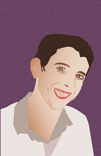
This is Ryan. I chose a tilted head pose, instead of straight on. This took an incredibly long time. I tried to use some gradient mesh in the face, but it just wasn't turning out right. I couldn't get it to look not splotchy, so I went with the regular gradient. The colors were very challenging to work with since there are so many different flesh colors. I also cut myself out of the original photo, so there was some guess work in some of the shapes. Overall, I am happy with this. This is definitely the most difficult illustration to date.
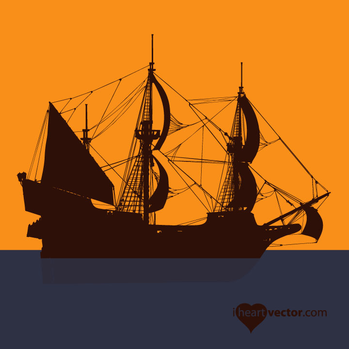
Pirate Ship

Here is a pirate ship I found on iheartvector.com until I have my own art to post.
Thursday, July 14, 2011
Tuesday, July 12, 2011
Movie Poster
I chose the movie up for my poster. It was hard to beat the posters that Disney put out, but in typical Disney fashion, I think this poster creates interest and mystery as to what the movie could be about.
I took a shot from the movie of the man with his house and balloons and put text over it. I tried to make it so the man was easily seen. At first I had made the words progressively smaller, to give it perspective, but it was too difficult to read.
I took a shot from the movie of the man with his house and balloons and put text over it. I tried to make it so the man was easily seen. At first I had made the words progressively smaller, to give it perspective, but it was too difficult to read.
Logo Assignment
I made this logo for my friend, whose last name is Gearhart. He may use it for his engineering consulting. His daughters requested the pink and purple... but I also made him a black and white one.
I tried to made the heart logo 3D, but I kept getting a memory error. So, I settled on just the letter being 3D. I may give it another go and try some simpler shapes to make the graphic 3D.
I tried to made the heart logo 3D, but I kept getting a memory error. So, I settled on just the letter being 3D. I may give it another go and try some simpler shapes to make the graphic 3D.
Monday, July 11, 2011
Type Assigment
Once again, most of these effects are easier to do in InDesign, but it is good practice using Illustrator. These were not difficult to do in Illustrator, so I would be comfortable using either program.
Calendar Icon
This was harder to make than I thought it would be. I think it was because the instructions could be better.
Sunday, July 10, 2011
Artist Assignment
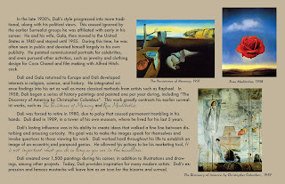
This assignment was to choose an artist and create a work of art in their style and also include some of their art. I chose Salvador Dali. My work is meant to be a magazine spread, 4 pages. The art on the front is not necessarily Dali's style, but uses his common colors and the theme of "photographed dreams". Dali used a lot of blues, browns, and yellows and lots of gradients in his early surreal work. I decided to highlight the areas opposite of the expected, to play on a surreal feel. I found it much more difficult to use Illustrator for this instead of InDesign. It would be best to create the art using Illustrator then place into InDesign to manipulate the text and overall layout.
"A true artist is not one who is inspired, but one who inspires others."
Thursday, July 7, 2011
Wednesday, July 6, 2011
Fruit Part 1
My next assignment is to create fruit. Here is part 1: a whole lime and a sliced lime.
COMING SOON: COCONUT!
COMING SOON: COCONUT!
Subscribe to:
Comments (Atom)


