I decided to "draw" a tree using the parts of the tree. I based it off an existing sketch, otherwise it would look like a blob. It was easier than I thought it would be, but much harder than it looks.
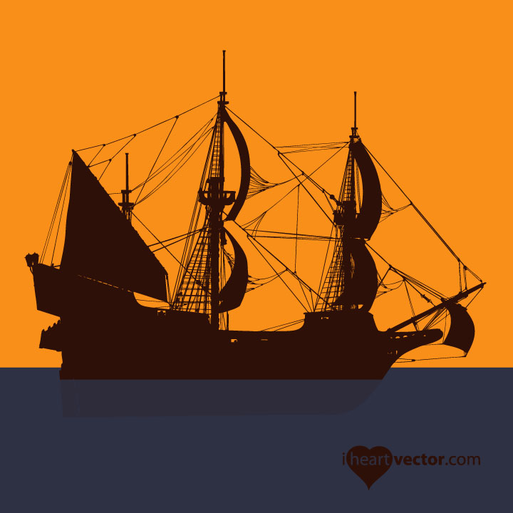
Pirate Ship

Here is a pirate ship I found on iheartvector.com until I have my own art to post.
Monday, June 27, 2011
Saturday, June 18, 2011
Illustrator Assignment #3 Animal and Landscape
My next assignment is to put my animal from the last lesson (take a look at my lizard) and put it into a landscape.
I took inspiration from Ryan's photo from Death Valley.

I took inspiration from Ryan's photo from Death Valley.

Thursday, June 16, 2011
Numbers Assignment

Updated Lizard Drawing
Revised
Original
Tuesday, June 14, 2011
Illustrator Assignment #1- Symbol Collage
The first assignment was a symbol collage. This is the last collage I made. I used symbols built into Illustrator and also found the swirl at iheartvector.com. I used the symbol sprayer for the hearts and grass. I used the polar grid to make the spiral with snowflakes in the upper left corner. The atom graphic is a symbol from illustrator, but behind it is a star on the end of a stick that I rotated and duplicated 360 degrees. I had a hard time actually getting the color I wanted in swirl gradient at first, but I eventually figured it out.
This is the second collage I made:
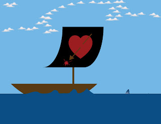
I knew I wanted to have something pirate themed for my blog and art site, so this was a decent first attempt. I couldn't find a free skull and cross bones symbol, so I made up my own logo for the flag. I used the symbol sprayer for the clouds and the paint brush for the waves on the boat. Those could use some work. The shark fin is an Illustrator symbol that is partially behind the water.
This is my first document in Illustrator.
The trees, flowers, grass, were all sprayed symbols. The rocks I placed near the pond. I made the pond using ellipses that I merged into one shape using the shape builder tool. I placed the grass in the lower right in front of the pond and used the draw behind feature to make sure the grass and flowers were behind the pond, not floating in it. The trees are a little out of proportion, but are ok for a first shot. I edited the flowers in the symbol editor to make them much much smaller. I didn't see any fish symbols I wanted to put in the pond (they all looked very tropical), so I put a shark instead.
These were great practice.
Illustrator Assignment #2- Animal Drawing
I just finished my first Illustrator Drawing. I'm going to clean up some of the lines tomorrow so they are smoother. I'm posting this first go around now, so I can take a look at the before and after.
To do this, I used the sketch shown above. I outlined the main body and the legs for one layer. I outlined the "underbody" portions of the body, tail, and neck. Next I outlined the spots to put on their own layer. Last, I outlined the eye. I then used a fill color for each of the new layers and arranged the layers from front to back.
To do this, I used the sketch shown above. I outlined the main body and the legs for one layer. I outlined the "underbody" portions of the body, tail, and neck. Next I outlined the spots to put on their own layer. Last, I outlined the eye. I then used a fill color for each of the new layers and arranged the layers from front to back.
Subscribe to:
Comments (Atom)


